Mega Man: Dr. Wily’s Revenge
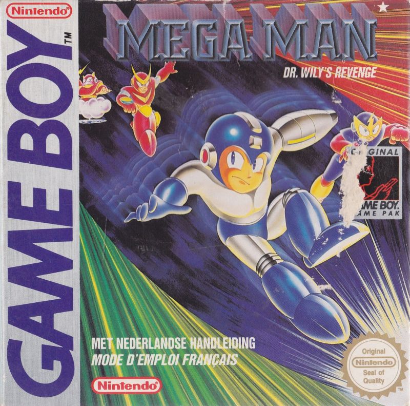
- Japanese release in July 1991
- North American release in December 1991
- European release in 1992
- Australian release in 1995
- North American release in May 1996
- Japanese release in March 2001
- Developed by Capcom
A First Attempt at the Blue Bomber

On Game Boy Essentials, we looked at games no one would include in a best-of list, games that are essential because they’re horrible, but now we get our first game that’s arguably unessential. I had a really hard time deciding whether the first Mega Man game on Game Boy was essential or not. Why not consider it? Because it’s too difficult. The jumps required are so precise, the enemy placement so unfair, the bosses’ room so small, that you often find yourself dying because you just couldn’t react properly. I went back and forth on writing an article about it because there are four other classic Mega Man games that improved on the formula set in place by this particular title without being as hard. All those are much more essential.
Then why do I think it is essential and that you should play it? Because the people at Minakuchi Engineering got the fundamental gameplay exactly right on their first try; they just dropped the ball with everything else. And I think you should play it to witness those two conflicting realities in motion.
Minakuchi Engineering
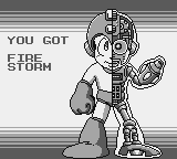
When you think of who created Mega Man you immediately think of the man people tend to call his father, Keiji Inafune. Inafune is called Mega Man’s father but he seems to have adopted the child during pregnancy. Akira Kitamura created the sprite used for the character and only after that did Inafune come in and create artwork to represent the character on the covers and manuals. Mega Man was built completely backward: a sprite first, a character second. To top it off, Inafune truly became the steward of the Mega Man series only starting in 1990 with Mega Man 3.
Keiji Inafune and the rest of the main Mega Man team at Capcom worked on none of the Game Boy titles. Mega Man: Dr. Wily’s Revenge is actually the first Mega Man game to have been worked on by another studio. Minakuchi Engineering, who got the job, had some experience with the Game Boy. They had previously worked with Nintendo on Game Boy: they co-developed SolarStriker with R&D1.
Minakuchi were thus given a daunting task: translate the solid foundations of Mega Man for Game Boy.
Fundamentals Done Right
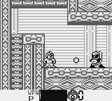 He’s got a new hat!
What do I mean by fundamentals done right? Look no further than the difference between the NES and Game Boy sprite of Mega Man. Aside from an added black border to his helmet to compensate for the lack of a fifth colour, the Game Boy sprite is pixel-perfect with the NES sprite. I have seen one other slight change; they moved his arms further up when he jumps making him use less horizontal space when in the air. Game Boy Mega Man overlaid over NES sprite. Look at the arms.
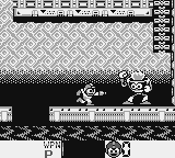
Considering that Capcom never once altered the sprite of Mega Man for six games on NES, I’m sure they were the ones who decided on so few sprite changes for the Game Boy. To me it’s so funny that the sprite in the games was always sacrosanct but the box art was consistently all over the place. You have frumpy redrawn faces for American audiences, separate redrawn faces for European audiences, weird gun arms, wrong colours, broken proportions, the works. Anyway, I would bet Capcom designers drew the Game Boy sprites internally at Capcom and then handed them to Minakuchi. Knowing that the sprite was designed first, this seems a likely explanation. This decision not to redraw Mega Man to be any smaller means that Mega Man covers a much larger percentage of the screen than on NES. See for yourself. A screenshot of Mega Man I on Game Boy overlaid over Mega Man 1 on NES. See how much more of the level you can see on NES.
You can see here how much you can’t see on Game Boy. Something had to give. There are other games like Super Mario Land or the first Batman game on Game Boy that took different approaches to the limited screen of the system. Mega Man on Game Boy’s approach: don’t change the Blue Bomber, change the world around him. There were games with large sprites before Mega Man. Fist of the North Star, TMNT: Fall of the Foot Clan, Ninja Boy, Metroid II: Return of Samus, and many more. But while most games released before then were not always successful at their attempt to use large-sized sprites on Game Boy, Mega Man did something really right. This first Mega Man title will perfect the standard way of making a NES game work on Game Boy: you adapt every element of the gameplay for the smaller screen without changing the size of the characters and enemies.
The first thing they had to change was the size of the environment. Mega Man controls the same and looks the same so he jumps a full third of the screen on Game Boy. This comes with a lot of caveats. They could not for example put a pit with a flying enemy heading your way from the other side of the screen. If this were to happen the enemy would appear too quickly, you would have no time to react and end up at the bottom of the pit a very frustrated player. All sorts of little details had to change to keep the experience fun. Something as innocuous as an enemy falling from the top of the screen had to be reengineered when done on Game Boy.
Lack of Practice
They did succeed in making sure the upcoming environmental challenges were always on the screen. Unfortunately, they made way too many jumps too difficult to clear when adjusting the gameplay. Pits in this game are always painful and difficult. Some of them seem to give you only a couple pixels of leeway.
The enemies are usually the same size and act the same as on NES, and are as varied. It’s great for presentation but that means they give you less time to react since they’re always so big and so close to you. Imagine a robot with a shield in front of you; when he shoots you have less time to jump than you would on NES.
Big enemies are even more of a pain to deal with. Those encounters were not made for the small Game Boy but they still tried to make them happen. You would encounter those big enemies in all kinds of varied situations on NES but here they had to relegate them to enclosed spaces. Coupled with the fact that all the rooms have walls and floors that are very thick, those encounters feel cramped and unpleasant. Even if they did redraw those large enemies to be smaller. The bosses suffer from the same thick walls problem. For Mega Man IV, they would make the walls as thin as they could, giving you just a bit more space to fight the master robots. We’re talking a dozen pixels but the effect is striking. In Mega Man I, you feel the cramped screen. In Mega Man IV, the boss rooms feel big enough.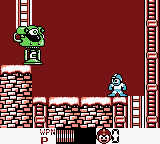
Did you know that Mega Man I on Game Boy also has four robot Masters from Mega Man 2 on NES? It’s a kind of ad hoc tradition with the Game Boy titles to include four robot masters from the numbered NES counterpart and four from the next game. Here the tradition was born, and once you reach the teleporters in the last Wily stage where you would usually refight the robot masters, you get a surprise! Flash Man, Quick Man, Bubble Man, and Heat Man from Mega Man II are who you face instead. The game did not include Guts Man and Bomb Man from Mega Man 1, but the four extra bosses are meant to be a twist on the formula; unfortunately it kind of falls flat. They appear so late in the game that their presence feels like an afterthought. There’s no buildup, no expectations, they just suddenly appear. With each new Mega Man game the four extra robot masters would start appearing earlier and earlier and gain in prominence.
Finally, the password system is exactly the same as on NES, which does not translate well to a portable system. You get a different password after every completed robot master, which is nice and feels appropriate but once you hit the Wily stages, you get one password to start from the first stage and that’s it. I’ve always felt the lack of Wily passwords was a shame on NES. On Game Boy, where you play much shorter play sessions, it’s downright exasperating.
The Things Unsaid
I could talk about the many other things related to the game: the level design inspired by the first game, the music, how the presentation makes the background elements non-obstructive, the gameplay loops, the ending, whatever. I’m not going to dwell on those things, however, because they’re not what makes this game essential. They’re kind of inconsequential. I’ve already talked about what makes Mega Man: Dr. Wily’s Revenge essential. The rest is serviceable, evocative of a Mega Man game but clearly on the cheap side.
Conclusion
Ultimately, I think Capcom knew they had good fundamentals but a flawed product with Mega Man: Dr. Wily’s Revenge. Why? They gave the job of making Mega Man II on Game Boy to a different developer, Biox. They ended up releasing Mega Man II in Japan a mere five months after the first game. To me that screams of “we know the first one was too hard but this second one’s easier.” However, Mega Man II was too easy and kind of crappy, so Capcom went back to Minakuchi Engineering for all the following Game Boy Mega Man games. That’s why this game is essential. It’s a testament to Capcom’s trust that this group of developers did a great job setting up the fundamentals of Mega Man with the first game and were trusted with getting the franchise back on track when Biox led it askew. They ultimately did. We’ll get to those better games in due time.
This article was first published on the .
This article was last modified on the .